This is not anymore the most recent version of the API. Please refer to the newest post.
CairoPlot now has a Mailing List! For more information, refer to: this post.
So, a while ago, I’ve decided to code a library to plot some information I had.
The idea was to create simple graphics in a way they would be easy to create, beautiful and good to present to people with no or few backgrounds on math and computers.
For the ease one creation I, obviously, used Python 😀
And, as I was already a PyCairo enthusiast (that began by the time I read Aventuras no cairo by Marcelo Lira and, as pointed out by him, this other one), I decide to use it to draw my graphics.
On this first version, the CairoPlot library provides 3 functions:
dot_line_plot()
Function to plot graphics using dots and lines as seen below.

dot_line_plot (name,
               data,
               width,
               height,
               background = None,
               border = 0,
               axis = False,
               grid = False,
               h_legend = None,
               v_legend = None,
               h_bounds = None,
               v_bounds = None)
name – Name of the desired output file, no need to input the .svg as it will be added at runtim;
data – The list, list of lists or dictionary holding the data to be plotted;
width, height – Dimensions of the output image;
background – A 3 element tuple representing the rgb color expected for the background. If left None, a gray to white gradient will be generated;
border – Distance in pixels of a square border into which the graphics will be drawn;
axis – Whether or not the axis are to be drawn;
grid – Whether or not the gris is to be drawn;
h_legend, v_legend – lists of strings containing the horizontal and vertical legends for the axis;
h_bounds, v_bounds – tuples containing the lower and upper value bounds for the data to be plotted.
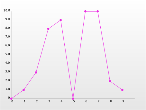
Example of Use
teste_data = [0, 1, 3, 8, 9, 0, 10, 10, 2, 1]
CairoPlot.dot_line_plot('teste', teste_data, 400, 300, axis=True)
Result:
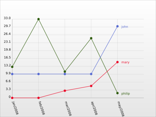
teste_data_2 = {"john" : [10, 10, 10, 10, 30], "mary" : [0, 0, 3, 5, 15], "philip" : [13, 33, 11, 25, 2]}
teste_h_legend = ["jan/2008", "feb/2008", "mar/2008", "apr/2008", "may/2008"]
CairoPlot.dot_line_plot('teste2', teste_data_2, 400, 300, h_legend = teste_h_legend, axis = True, grid = True)
Result:
pizza_plot()
Function to plot pizza graphics.

pizza_plot(name,
           data,
           width,
           height,
           background = None)
name – Name of the desired output file, no need to input the .svg as it will be added at runtim;
data – The list, list of lists or dictionary holding the data to be plotted;
width, height – Dimensions of the output image;
background – A 3 element tuple representing the rgb color expected for the background. If left None, a gray to white gradient will be generated;
Example of Use
teste_data = {"john" : 123, "mary" : 489, "philip" : 600 , "suzy" : 235}
CairoPlot.pizza_plot("pizza_teste", teste_data, 500, 500)
Result:

gantt_chart()
Function to create Gantt Charts.

Note: the output for this function was based on the graphic seen on this post from wired.
gantt_chart(name,
            pieces,
            width,
            height,
            h_legend,
            v_legend,
            colors)
name – Name of the desired output file, no need to input the .svg as it will be added at runtim;
pieces – A list defining the spaces to be drawn. The user must pass, for each line, the index of its start and the index of its end. If a line must have two or more spaces, they must be passed inside a list;
width, height – Dimensions of the output image;
h_legend – A list of names for each of the vertical lines;
v_legend – A list of names for each of the horizontal spaces;
colors – List containing the colors expected for each of the horizontal spaces.
Example of Use
pieces = [ (0.5,5.5) , [(0,4),(6,8)] , (5.5,7) , (7,8)]
h_legend = [ 'teste01', 'teste02', 'teste03', 'teste04']
v_legend = [ '0001', '0002', '0003', '0004', '0005', '0006', '0007', '0008', '0009', '0010' ]
colors = [ (1.0, 0.0, 0.0), (1.0, 0.7, 0.0), (1.0, 1.0, 0.0), (0.0, 1.0, 0.0) ]
CairoPlot.gantt_chart('gantt_teste', pieces, 600, 300, h_legend, v_legend, colors)
Result:

So, I think it’s ready for you guys to use. CairoPlot Google Code Project
The support is also open :D, whenever you need, feel free to contact at alf.rodrigo@gmail.com or leave a comment.

Wow!!That’s what I’ve benn looking for for a long time~!!
Thanks for sharing this post~~.
For Josh (or anyone interested):
The relevant part in the code is:
def render_series_labels(self):
#FIXME: implement this
for key in self.series_labels:
pass
#This was not working in Rodrigo’s original code
I don’t know why it was working before in fact, maybe in some older revision?
Anyway I’ve hacked a quick solution to circumvent the problem:
Add these four lines at line 368 in CairoPlot.py just after the “for value in series:…” loop
line_label_x = self.width – self.borders[HORZ] – horizontal_step / 2
line_label_y = plot_top – int((series[-1] – self.bounds[VERT][0])* vertical_step)
cr.move_to(line_label_x , line_label_y)
cr.show_text(self.series_labels[number])
The labels may overlap and are cut if too long. Let’s say it is better than nothing.
Because I’m a noob at maths, I’d like a way to have lines in a line chart rounded corners.
oh and instead of assuming we will save it as a file, let us save it to a filestream instead.
Hi !
I’m currently working on a web service to produce various charts. It would be really nice if there was a way to specify multiple colors for each line in the gantt chart, e.g.
colors = [ (1.0, 0.0, 0.0), [(1.0, 0.7, 0.0), (0.0, 1.0, 0.0)], (1.0, 1.0, 0.0), (0.0, 1.0, 0.0) ]
The effect of this would be to have the rightmost orange bar of the second data in green color. This way I could create arbitrary colored stripes on each line, and not just be limited to one color.
The reason I want this functionality is to have the gantt chart show various “states” of something over time. It could be even more effectful with a gradient between each color data. Imagine something a hot temperature indicated by a red color that is cooling down (the gradient) into another color, e.g. blue.
Cheers
/Magnus